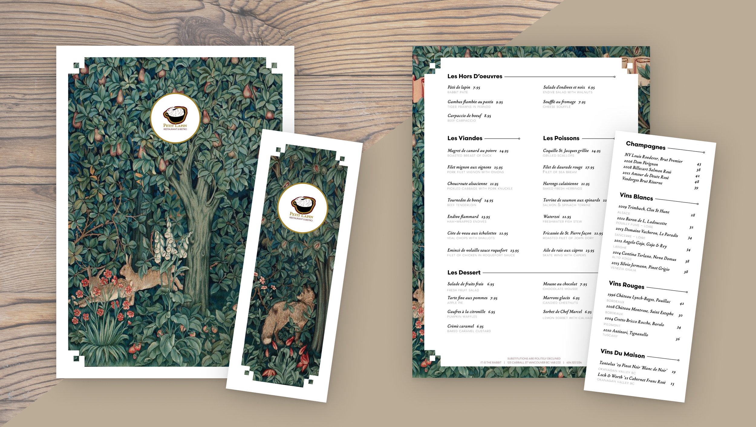
Restaurant Brand Identity ➞
Menu design in InDesign and logo concept for a French Bistro
Petit Lapin
Logo • Menu Layout

Restaurant Menu & Logo
Academic Project BCIT
Timeline
2 Weeks
Deliverables
Dinner Menu
Wine List
Logo
Brief
Create and visually design an unique brand identity for a French restaurant in the heart of Gastown, Vancouver BC. Petit Lapin is a chef-driven bistro style restaurant, serving classic French fare and wine pairings, offering a low key yet unforgettable experience for any occasion.
Direction
Gastown is a historic area in Vancouver, though the restaurant is modern it needs character to stand out amongst all the competitors. Menu items included very classic French bistro type meals, so the chosen direction is Classic Contemporary.
“Little Rabbit”

Logo Rationale
A fun and bold statement rooted in quintessential French cuisine. Caters to a specific audience, as French chefs don’t care much for substitutions.
Colors
Dark red, Gold (yellow), and green. Red and yellow are said to increase appetite because they’re associated with “safe” foods. Antique gold adds classic character. Green is associated with health, plants, herbs, fruit trees.

Imagery
Millefluers pattern is a French embroidery style, revived by William Morris in the Arts & crafts movement. Chosen to evoke a sense of quality craftsmanship & French inspiration.
Layout
1 Page for casual bistro inspired feel. Food & drink items arranged by order of consumption.
